top of page
COALESCE
BRAND IDENTITY

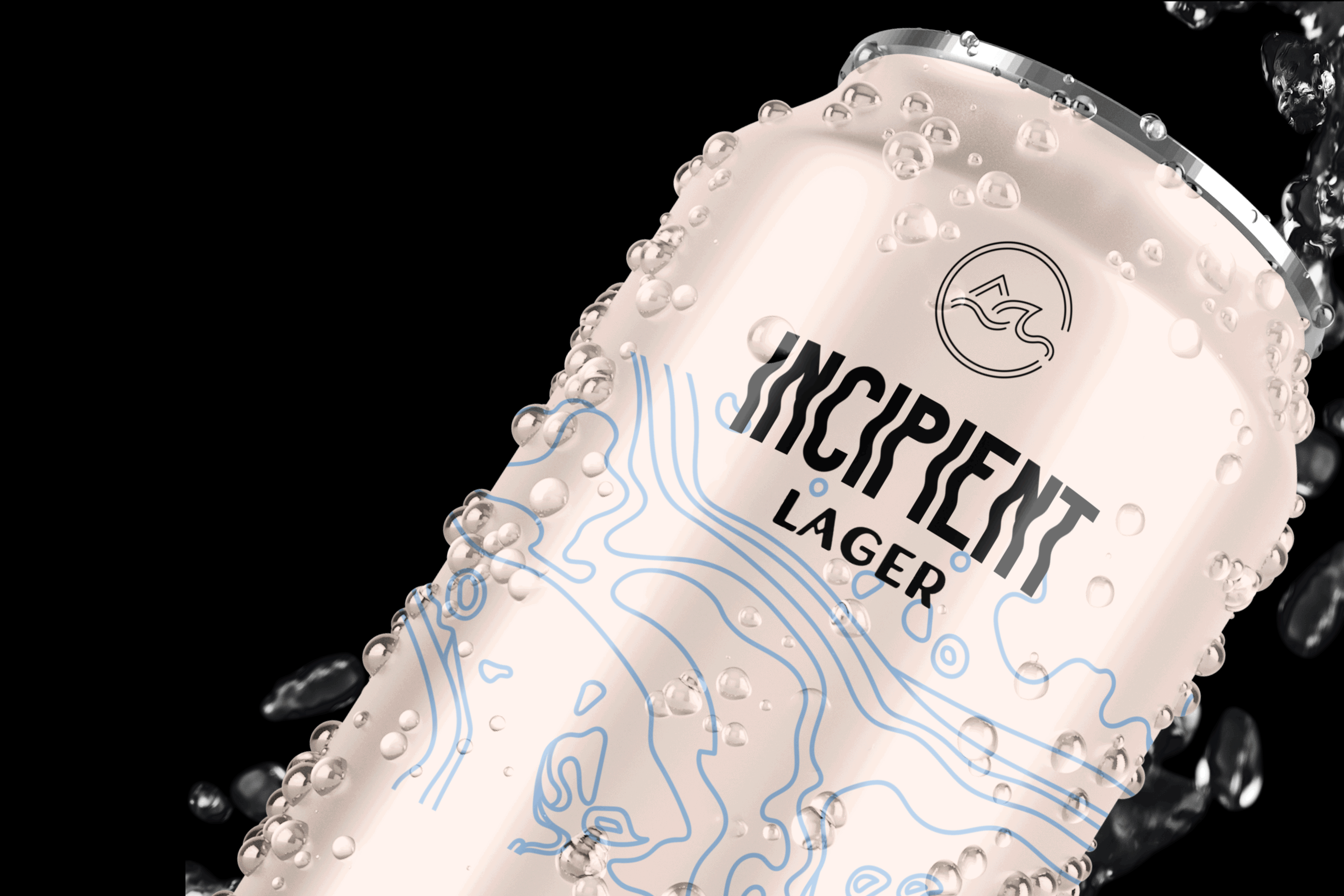
For this project, I created the brand identity for a hypothetical beer brand named Coalesce, a Japanese beer company whose drinks are inspired by the geological features of Japan. The client wanted a very minimalist, organic look that emphasized the ties to nature.
For the logo, I went with a line-based design. The triangular shape represents the mountains of Japan, the namesake of the Holocene IPA. The wave in the logo represents the coasts (Incipient), and the curved line underneath represents the soil (Kuro). Encompassing these elements is a "C," standing for Coalesce.
The line patterns on the cans are an iteration of a contour map of Japan. This pattern is also depicted on the back of the t-shirt below.
![[coalesce]_identity_Cover.png](https://static.wixstatic.com/media/bb76ef_22417c132500445fa3614dcf5b45d7ed~mv2.png/v1/fill/w_980,h_551,al_c,q_90,usm_0.66_1.00_0.01,enc_avif,quality_auto/bb76ef_22417c132500445fa3614dcf5b45d7ed~mv2.png)


bottom of page